38. Post-processing in Lightroom - ambient light
In general, software post-processing plays an important role in any photography today. Underwater, however, its importance grows exponentially. We all know how difficult it is to get the exposure, colors and contrast close to reality. But what does objective reality actually mean? No such parameter exists.
There is only one parameter in the formula that can be considered relatively stable. Daylight color scheme perceived by the human eye. And that's what we are aiming for to some extent. Since we want rich colors in our image, revealing their original color scheme is the only "objective reality" we have as a guideline. On the other hand, we are in the underwater environment, thus we do not want to exclude the water from our image. Whereas this fight between revealing the “true colors” while retaining the water element in our image pretty much describes our desired color scheme, as long as we have water in our frame, we never reach it 100%. It will always be a compromise. In the end, it comes down to subjective judgment as to how we want to interpret "objective reality". Do we want to emphasize some features of the image? Do we want to manipulate the colors so that the image acquires a specific mood? The answer is very complex and depends on the story we want to tell with our images.
In order to get the appearance of our photo where we want it, we must first understand a few principles and then use specific tools to adjust the “reality" to our liking.
To complicate things even more, we have to consider the mixed light sources available to us - natural (ambient) and artificial (strobe, still) light. While in ambient photography I use certain approach to achieve desired color scheme, in flash photography my post-processing technique changes significantly. The true magic is the combination of both techniques and both sets of tools to achieve the beautiful balance between background and foreground.
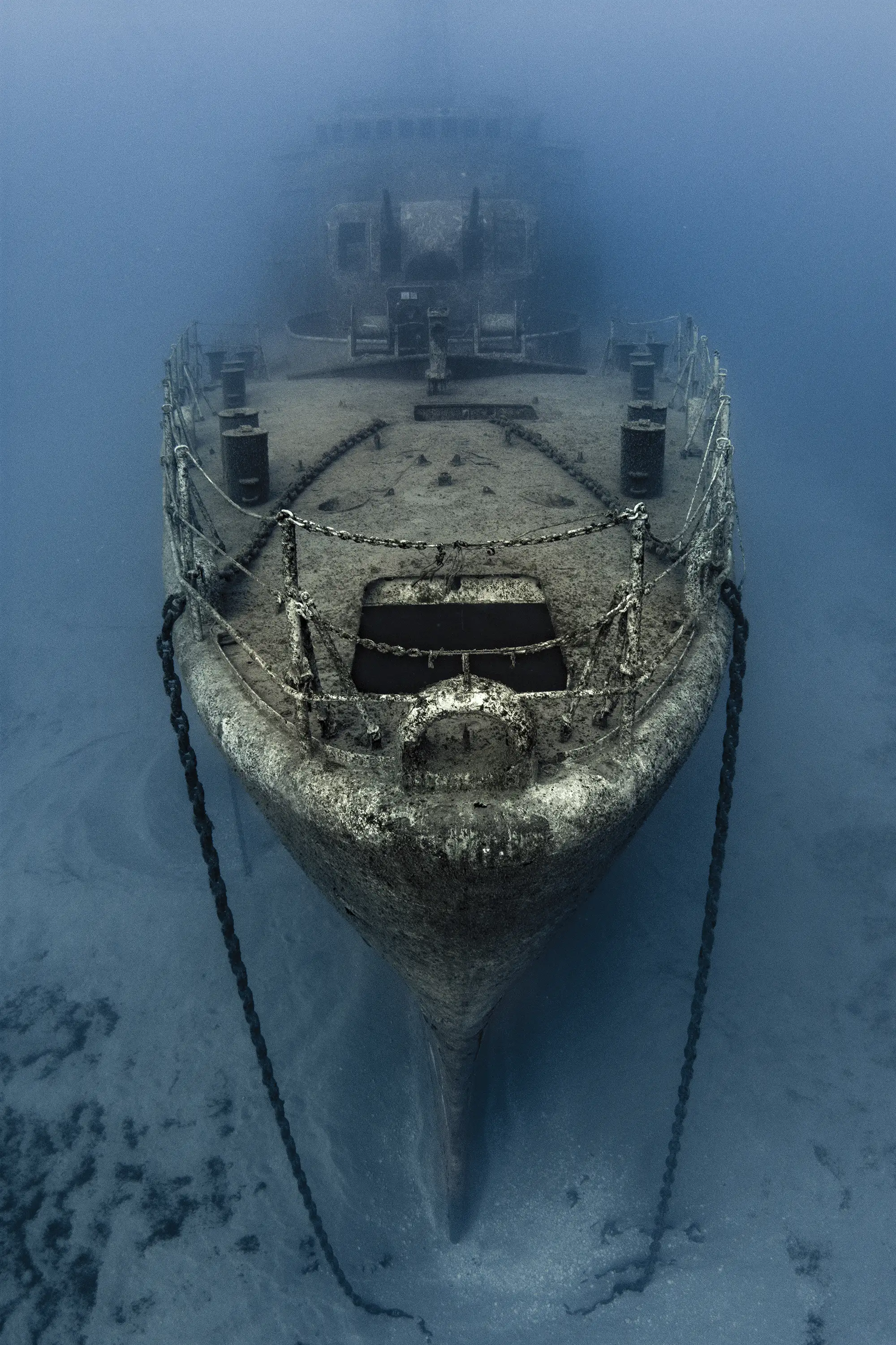
This issue focuses on the post-processing of ambient light images where the only light source is daylight coming from the surface. Large shipwreck scenes are typical examples where post-processing is just as important as the underwater stage of creation.
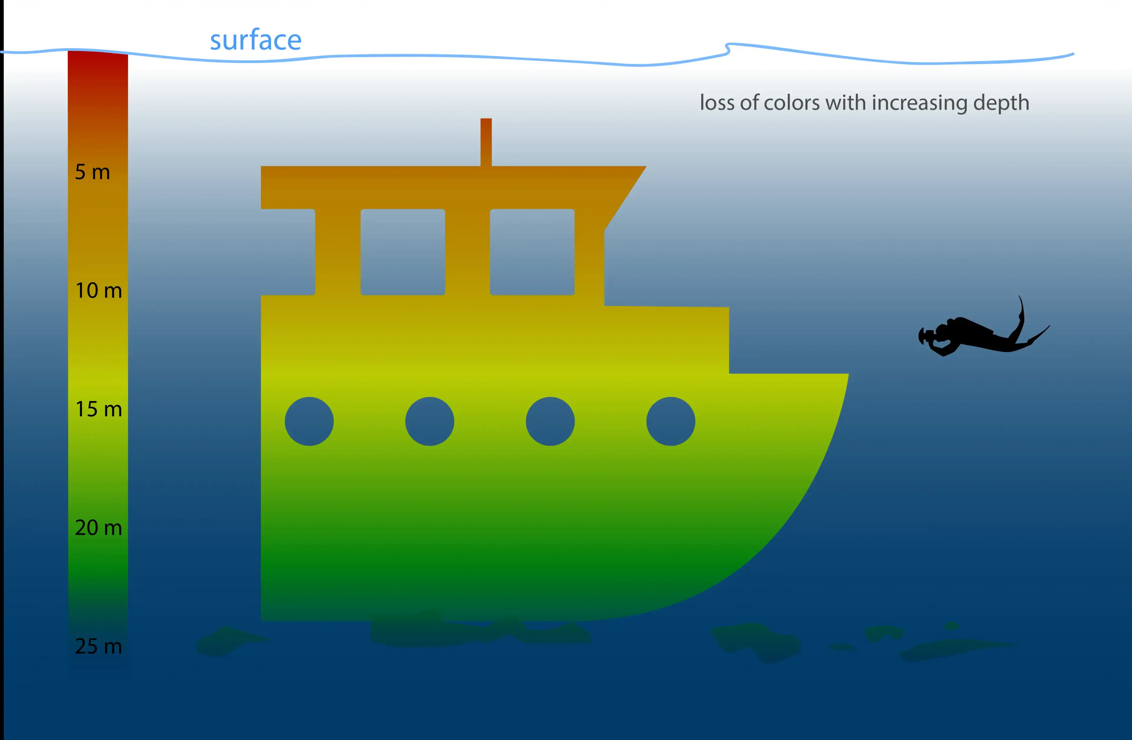
An important piece of information is the color loss diagram, which shows how warm tones disappear from the color spectrum as light passes through the water column. The red tones disappear from our image as shallow as 5 meters below the surface. Orange tones disappear at 10 meters and greens remain in the color spectrum up to a depth of 25 meters. This physical property determines the process of bringing color back into our image, but also shows the limitations of color recovery.
Tips to go around well:
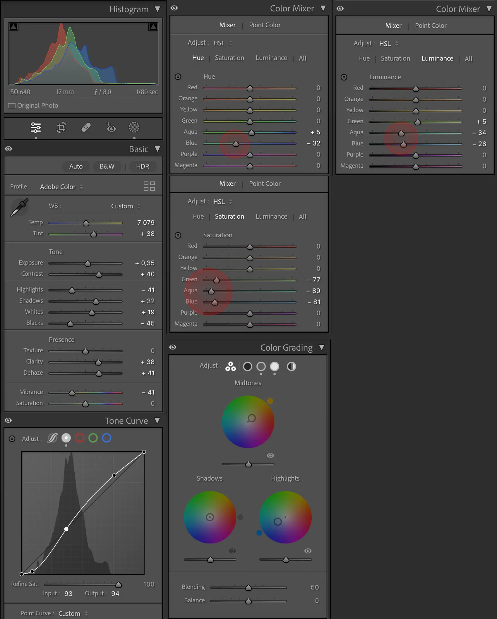
- Exposure in camera: The first step does not count under post-processing method, however critically determines the result. The more accurate the exposure in the camera, the easier the consecutive exposure/conrast/color managment in software and the better final results. By accurate exposure underwater I mean slight under-exposure with absence of any clipping spots in the frame, but still not too dark! Read the histogram. The entire curve should be spread out within the diagram, not exceeding neither the left or right borders the ceiling of the diagram.
- Tone: Typically, I initially drag the Exposure slider slightly to the right until I bring the the end point of the histogram curve to the edge of diagram. *The correction can also be done using the Tone Curve.
- Reveal the detail in shadows by moving the Shadows slider right.
- Decrease the highlights by moving Highlights slider left
- Play with 3 Presence sliders. I tend to Dehaze quite a bit and add a portion of Clarity. Do not overdo it. These two can be strong weapons, but can also do lots of damage if not used with caution.
- Go back to Tone and increase Contrast if needed. While playing with Presence sliders and Contrast you need to carefully watch the image as well as histogram!
At this point, our image should be pretty much adjusted in terms of exposure and contrast. However, based on our touch, the image may show color deviations that we need to work on.
- Color Mixer: I always start by lowering the saturation of the Aqua. Quick Tip - You can decrease/increase the saturation of any desired color by selecting the saturation knob, moving the cursor to the area filled with the desired color and dragging the cursor up and down while holding down the right mouse button.
- Slightly raise the Aqua hue. The combination of reducing the Aqua Saturation with increasing the Aqua Hue often results in an excessively "ugly" green, which may require additional manipulation of the saturation by dragging the green color slider to the left (decreasing the green saturation).
- I often reduce the luminance of Blue and Aqua in order to give my image a deep blue watermood.
- The final tool that can be used to support the desired tonality of our object is color grading panel. To emphasize rusty metal tones I drag the cursor of the Midtones toward the orange. As unwanted result, the blues in the background gain warm tonality. Correction require an opposite move in the Highlights. By pulling the cursor slightly towards blues in the Highlights I achieve nice blue tones in the background.
Corveta G. Pereira D'Eça
Nikon D7200
Seacam housing, Seacam 8" Dome port
Tokina 10-17 FE @17mm
no strobes
Settings: F8, 1/80s, ISO 640
Location: Porto Santo
November 2018